Tuesday, April 19, 2011
10: Everton Soccer Jerseys (Away 2010-2011)
Pink is by far my favorite color, but Everton's jerseys make me want to reconsider that fact. Many people say that "it takes a real man to wear pink" or men who are secure with their masculinity wear pink. But these uniforms are just awful. I would describe them as the farthest thing from manly. What makes these jerseys even worse is that they are away jerseys. The poor men on this soccer team have to wear these jerseys when they travel. When a team travels they have less of a fan base so you think they would like to look intimidating, but this team is not intimidating to any opposing fans or players with their pink uniforms. I would fully support these jerseys if they were pink for Breast Cancer Awareness or some other important cause, but without a cause these are just hideous, hot pink jerseys.
9: Old School Tampa Bay Uniforms
8: Montreal Uniforms 2001
No, these are not criminals on ice. These were the actually uniforms that Montreal's hockey team wore in 2001. Don't get me wrong, it is great that the team is sporting its country and team's colors at the same time but the horizontal stripes are just horrendous! The uniforms do match and the colors are not too crazy but put them all together and they look like patriotic prisoners. The uniforms look even worse when the whole team is standing together. It's is one big blur of red, white, and blue.
7: Seattle Seahawks
The lime green uniforms with matching gloves and cleats were worn in October of the 2009 football season and now they sport them in games every once in a while. These jerseys also make a lot of football fans worst uniform list. Neon colors might be in right now but that does not mean it works for football uniforms also. Hopefully these jerseys will not make a return appearance if we have an NFL season next year!
6: San Diego Padres
As Seminoles, we commonly sport this yellow/gold color. The color itself is not what makes the uniform ugly. The fact that the whole entire uniform is bright yellow is what makes them so obnoxious. What makes these uniforms even worse is the fact that tradition baseball uniforms are conservative colors like white with a few other colors on it. The Padres have the complete opposite of this. Standing out in the field will no be a problem for these old school uniforms.
5: Toronto Raptors 1995-1999
When you think of a rather large person dressed in a purple dinosaur outfit does come to mind but for most people that is not the Toronto Raptors, usually it is Barney. No, these are grown men playing a very masculine sport, dressed in all purple with what looks like a toy dinosaur on their jerseys. Very manly. This uniform might have been fit for a recreational team of ten year olds but not for the men who play on this team.
4: Denver Bronco's Throwback Jerseys
Some of the obnoxious uniform color combinations we can deal with because they are bright and they stand out in a good way. The Denver Bronco's throwback jerseys do not fit into this category. Brown tends to not look good on any uniform but especially not here. And the yellow! Bright, crazy, and overpowering. This uniform is just not meant to go together. Now to top off the horrible combination, we have the socks. Who ever told the uniform coordinator that those actually looked good? I guess if players are paid enough they really will wear anything.
Monday, April 18, 2011
3: Old School Astro's Uniforms
These uniforms scream seventies! This is because the Houston Astros wore these from 1975-1979. They might have been popular then but the only thing they are now is tacky. Not only did the team wear these to home games but they were also their away uniforms. So, the Astros wore these to every game for four years. That might have been a little bit over done. The theme of the orange stripes and stars that was stared in the seventies and continued in various ways until 1993. Tacky eventually got old.
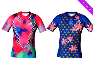
2: Paris's Rugby Uniforms
I think rugby is a pretty manly sport, but this teams uniforms make me rethink that idea. Men running around in tight, bright pink and blue uniforms is definitely not the manliest thing I have ever seen. This team has had a history of brightly colored jerseys with lots of flowers on them. When the idea of first putting pink on the jersey was brought up, it was quickly shot down by the referees but was later accepted. At least there will be no missing them on the field because you can see those uniforms from miles away!
1: Anything the Gators Wear!
I might be a little biased, but orange and blue together is just a disgusting combination. These jerseys might not be on the top of every Seminole's list. On my list, they will always be the ugliest. In my opinion, the top uniform shown here is the worst uniform they have ever had. They wore these in 2005 and it looks like they were going for a Micheal Jackson, one glove look but instead they did it with one sleeve. It is random and does not fit in with the rest of the uniform. The only place this uniform looks good is on the ground like Tim Tebow is showing in the bottom picture.
Subscribe to:
Comments (Atom)


